SPREADSHIRT
From Browse to Buy: Redesigning the Spreadshirt PDP
A two-phase redesign of Spreadshirt's product detail pages — fixing information hierarchy, restructuring the buy section, and surfacing trust signals to turn more visits into purchases.
Spreadshirt · Case Study
Spreadshirt's homepage was the first page to migrate to a new headless CMS (Amplience): an opportunity to rethink content structure and UX from the ground up.
What started as module redesign work evolved into a full-scale rebrand: a complete overhaul of brand, positioning, and user experience, which I co-led as one of four designers with specific ownership of the design system.
By 2023, the homepage was showing its age. It leaned toward creators by default: the designer tool had an entry point, but shoppers had no shoppable content and no path in. Neither audience had any real orientation: nothing on the page helped users understand what Spreadshirt offered or which experience was theirs.
Problem to Solve
The homepage had two audiences to serve. It was barely serving one.
To inform the redesign direction, I drew on behavioural data (heatmaps and click tracking), internal analytics (Adobe Analytics) and a Google CX audit of the existing homepage. Competitive benchmarking was also part of the research. Together these revealed a consistent gap: users arriving on the homepage couldn't quickly orient themselves or find a reason to engage beyond the fold.
~99% of homepage traffic was brand-driven: users already knew Spreadshirt. Yet many were leaving without engaging, pointing to a page that wasn't meeting the intent they arrived with.
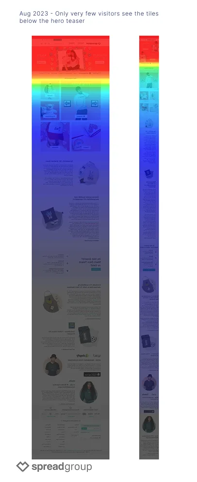
August 2023 heatmaps showed engagement dropping sharply after the main tiles: content below the fold was barely being seen. The hero CTA to the designer tool was well-used, but everything below it was invisible, particularly on mobile.
Mobile users showed bounce rates nearly twice that of desktop: a consistent gap across the measurement period.
The legacy CMS gave the content team one fixed grid to work with. Any structural change, a new section, an additional module, required developer involvement, making the homepage slow to adapt to campaigns or new priorities.
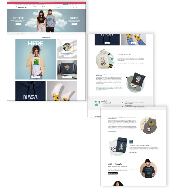
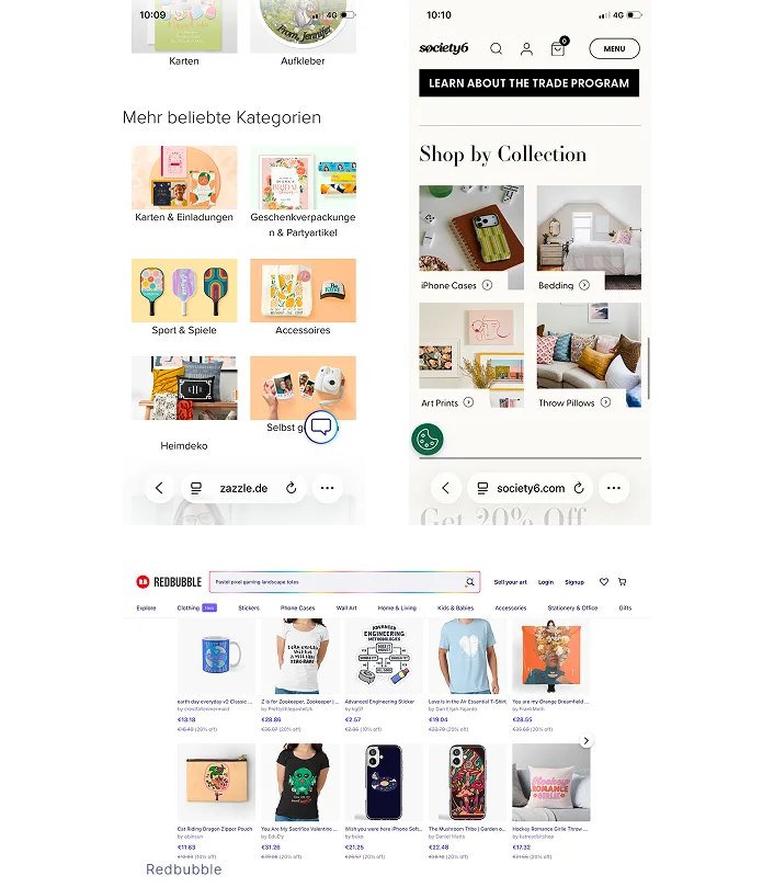
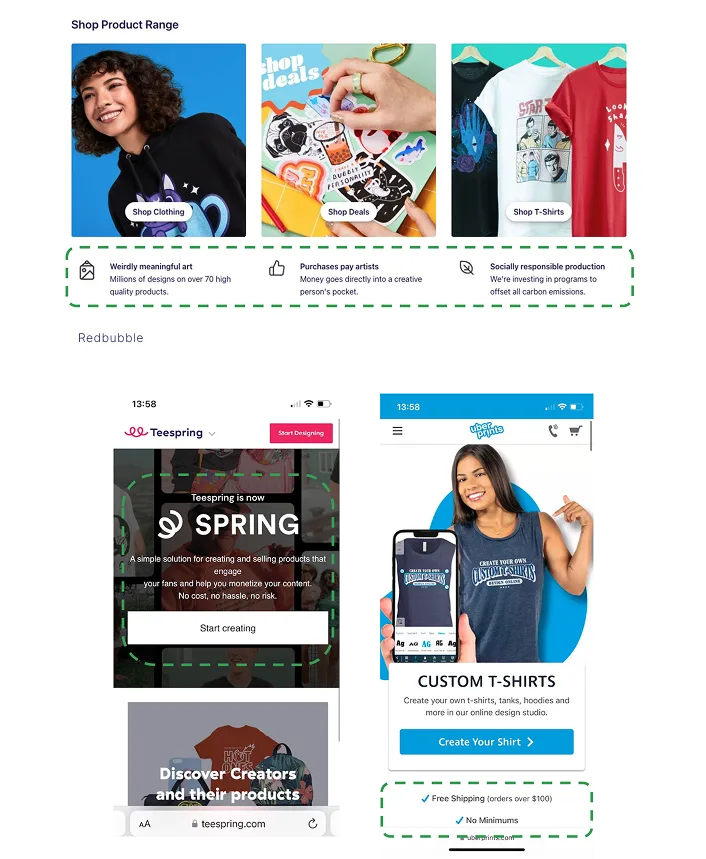
Competitors Analysis
Key Insight
Creators had a path. Shoppers didn't. And the business needed both.
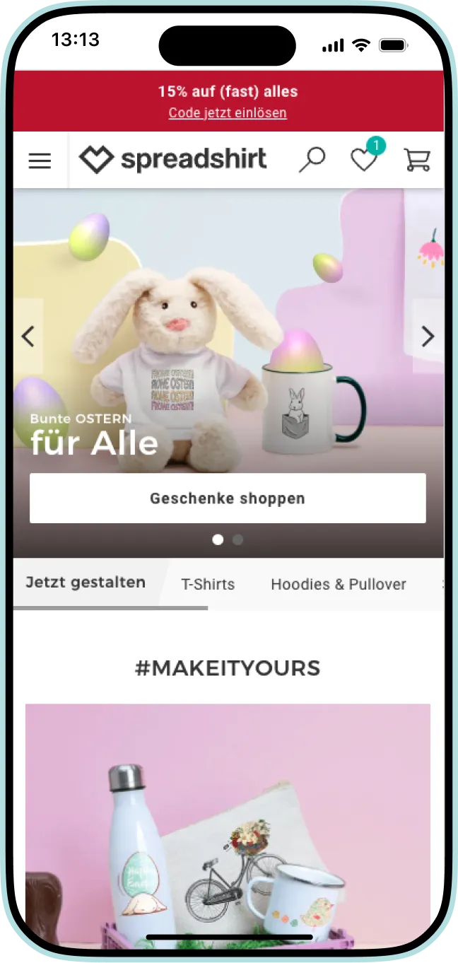
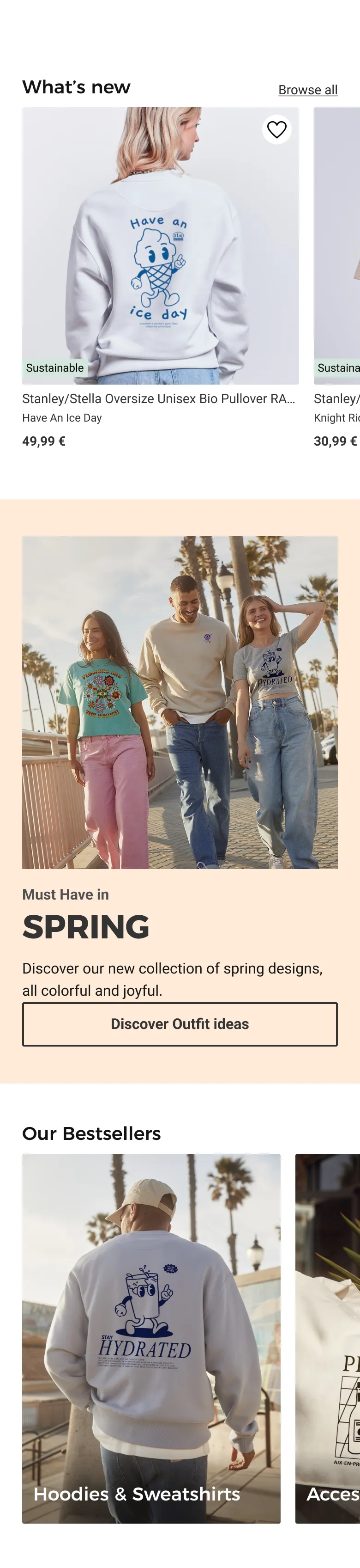
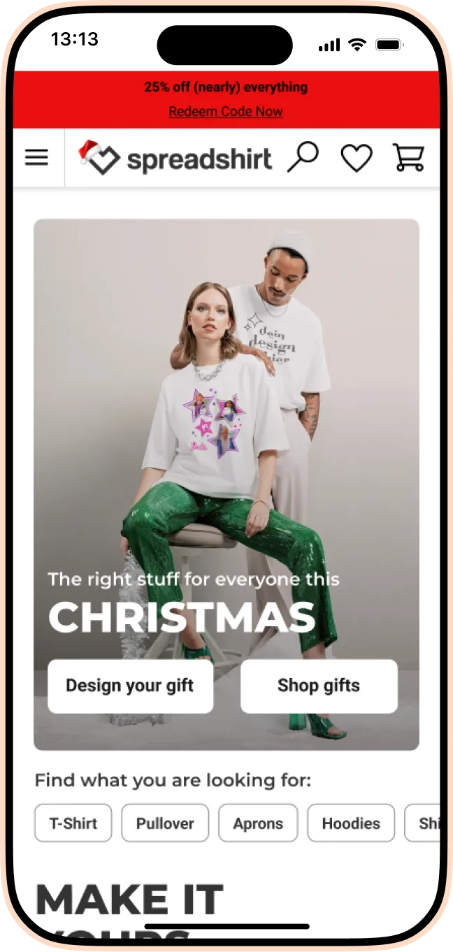
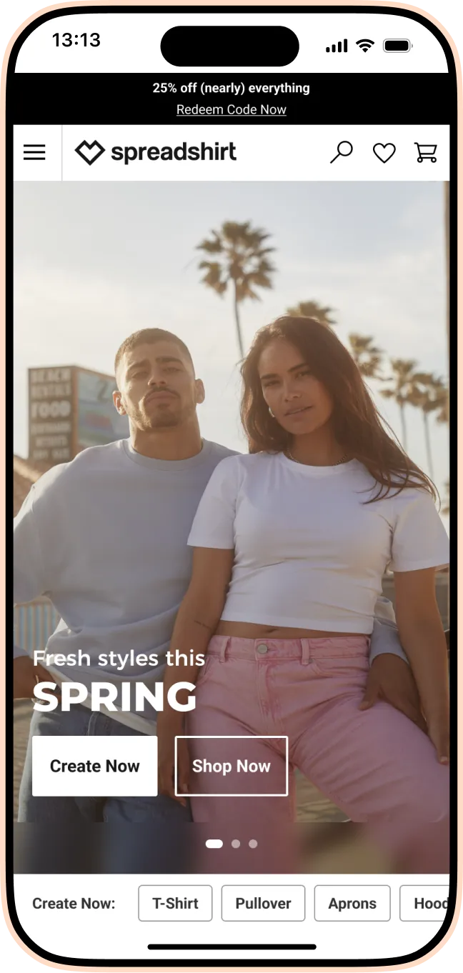
Before
Phase 1
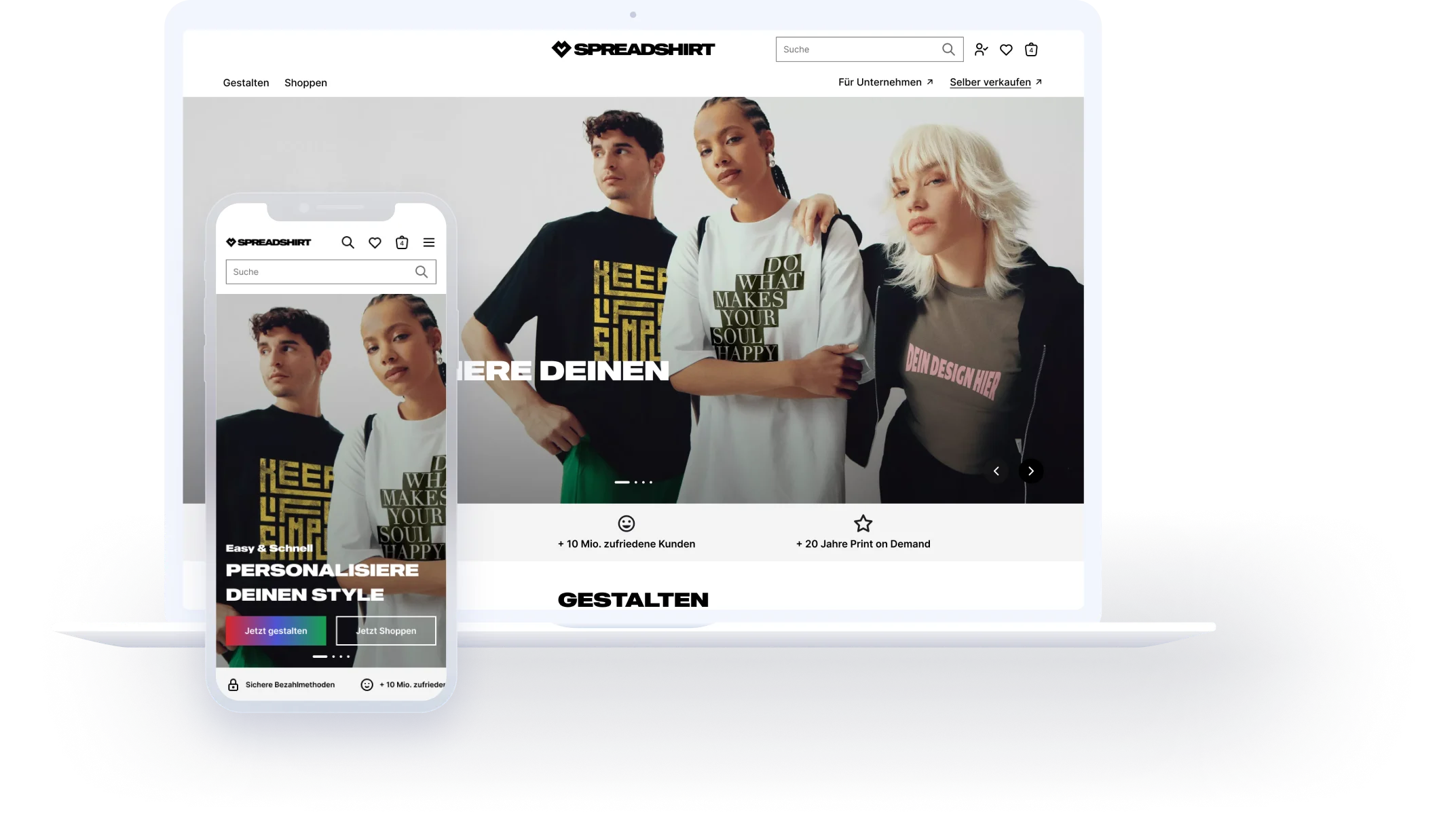
Due to the steep engagement drop-off, the viewport was restructured to lead with a clear, functional first impression: maximizing the space between navigation and fold for visual impact and immediate orientation.
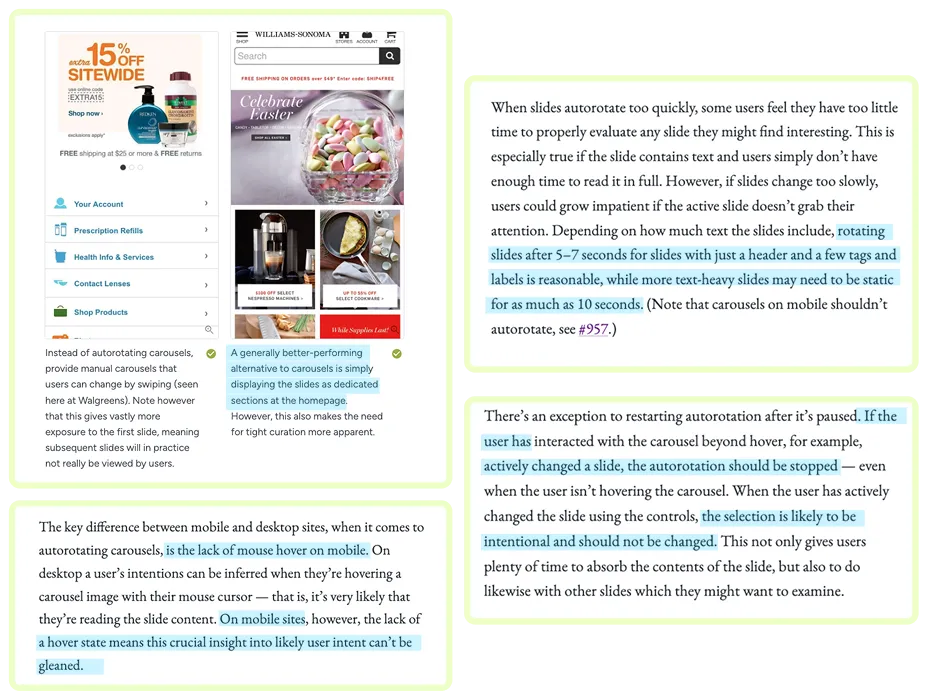
Shortcuts to the site's highest-traffic landing pages are anchored above the fold.
On mobile, the hero stays static. On desktop, slides rotate every 5 to 7 seconds and pause on hover, so users stay in control.
1st Iteration
2nd Iteration
3rd Iteration
Finale Phase 1
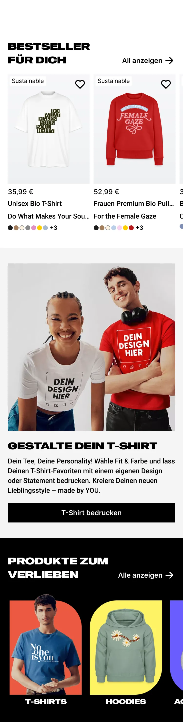
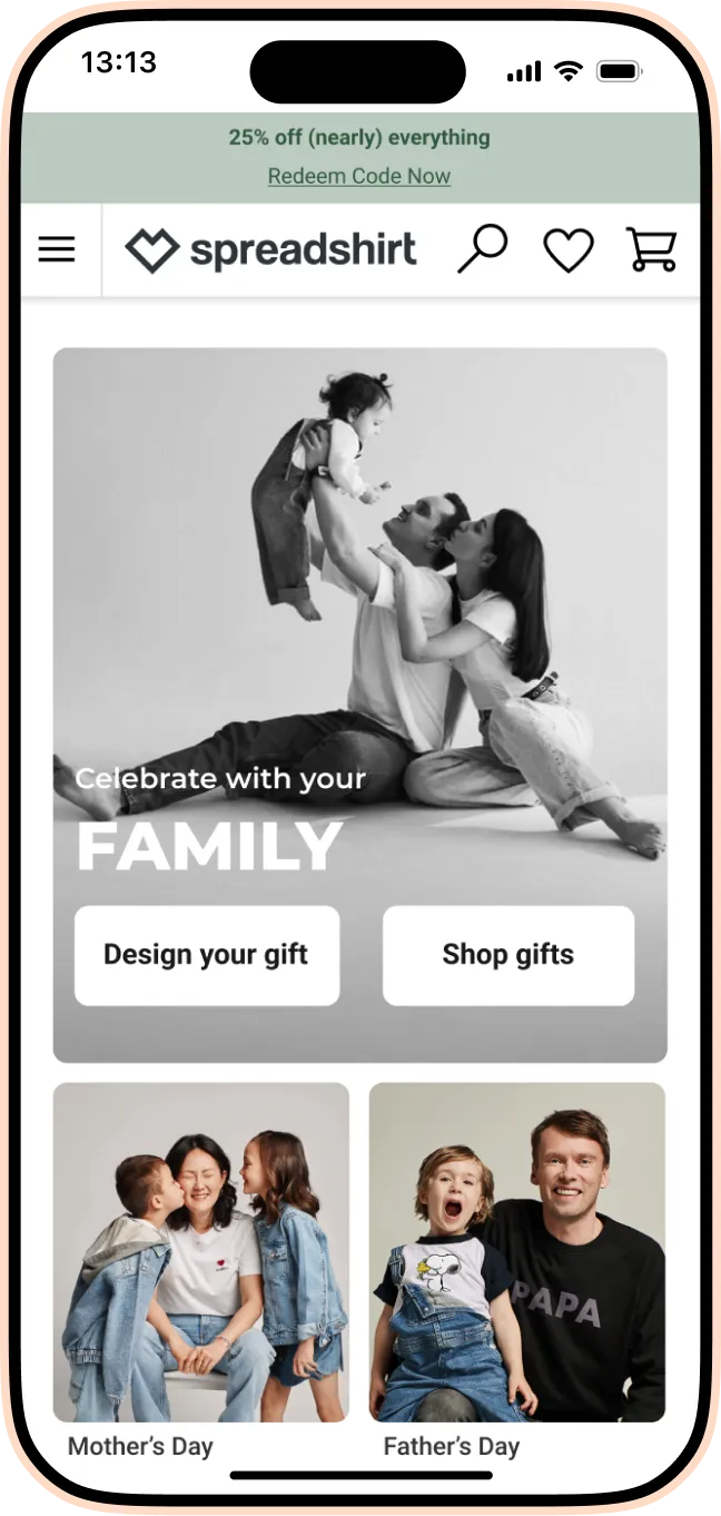
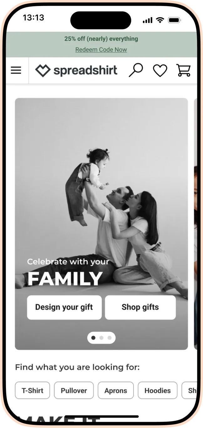
Phase 2
In Phase 2, the rebrand introduced a bold new identity across the entire creative journey. One structural shift: trust signals (such as "10M+ satisfied customers") and core USPs (such as a 30-day return guarantee) moved above the fold, replacing the SEO entry that had held that position in Phase 1. At this stage, converting hesitant shoppers mattered more than capturing intent-driven traffic.
The color gradient symbolizes the creative possibilities we offer customers through personalization, and core brand values:

The long SEO text had outlived its purpose. User testing confirmed what was already apparent: many users were only aware of one path. Those who had used Spreadshirt to create from scratch didn't know they could also shop ready-made designs, and vice versa.
A concise, structured module replaced it. Two offerings, clearly presented from the start.

Before
After
Before
After
The Full Picture

With the move to Amplience, the new homepage delivered a measurable lift. CVR increased, driven by clearer structure, shoppable content, and direct topic entries that weren't possible in the old CMS. Drop-off rate improved by nearly 40% from baseline. For the first time, content below the fold was getting meaningful engagement. The move to Amplience also gave the content team the ability to publish and update modules independently, without developer involvement.
Phase 2 launched as an A/B test. Early signals are mixed. Users are spending slightly more time on the page and U-turns dropped, suggesting the new experience creates less confusion. Drop-off rate increased marginally. The test was still running at the time of writing this case study.
This case study focuses on the homepage but the reality was bigger: Phase 2 touched every page, across two years, with a team of 14 developers, two POs, three business directors, freelance collaborators, and requirements coming from SEO, content, marketing, and UX copy simultaneously. I was the consistent thread: the only designer who held the full picture of technical constraints, business intent, and user needs throughout.
In an ideal world, I would have worked from problems rather than solutions. Phase 2 often started with a direction already set by leadership. More time to go deep on specific flows, test them, and iterate would have changed the outcomes. Whether that's realistic during a major rebrand and full site refactor, I'm genuinely not sure. But it's what I would push for next time.
More of the Spreadshirt work — from product pages to the enterprise B2B platform.
SPREADSHIRT
A two-phase redesign of Spreadshirt's product detail pages — fixing information hierarchy, restructuring the buy section, and surfacing trust signals to turn more visits into purchases.
SPREADSHIRT
Redesigning Spreadshirt's B2B experience to help enterprise clients manage bulk orders, customisation, and account workflows — making a complex platform feel simple.
If you're hiring for a product designer, I'd love to talk. Here's how to reach me.
I usually reply within a day.