SPREADSHIRT
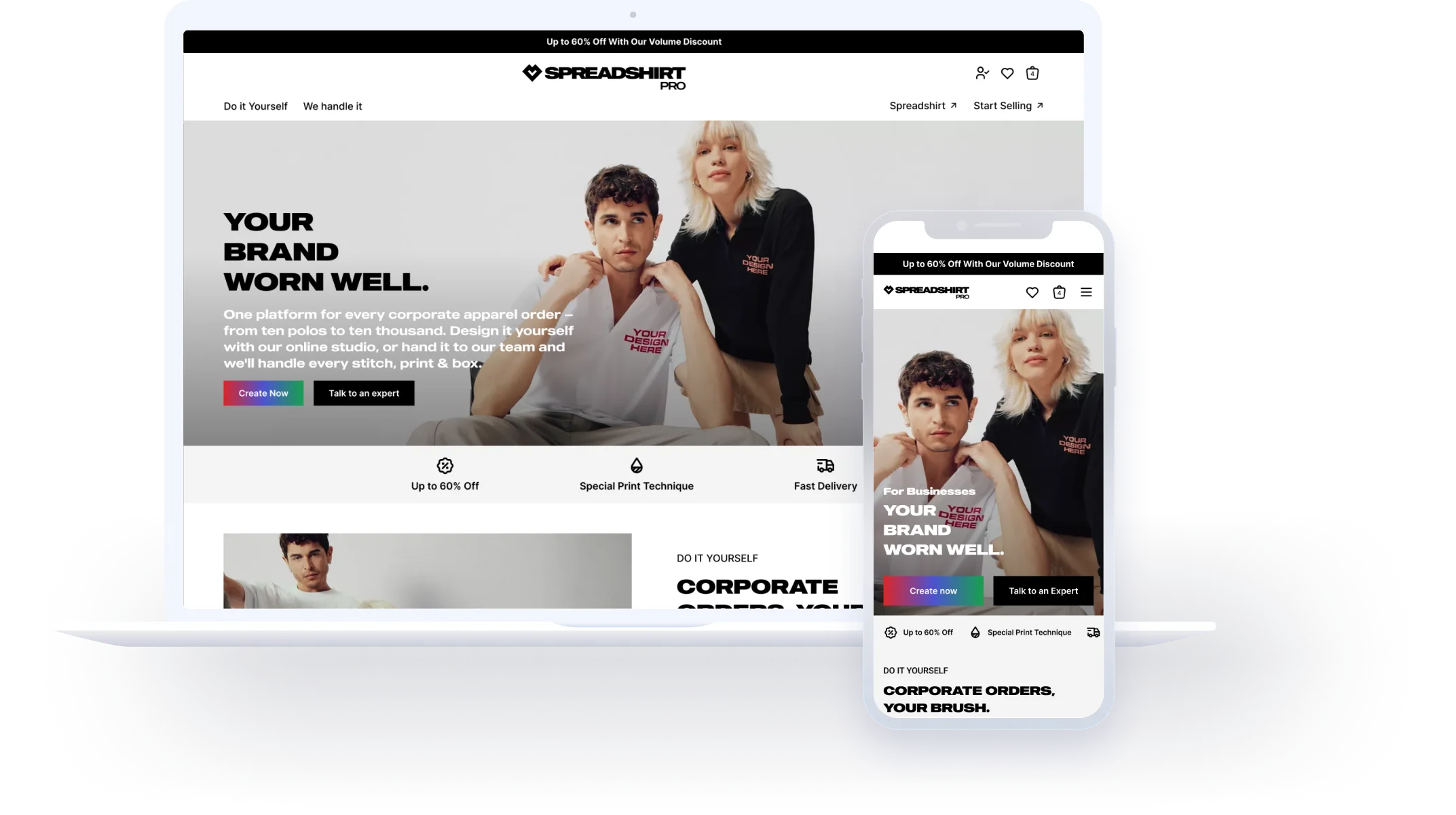
Revamp Spreadshirt Homepage
This redesign ultimately boosted conversion rates by 10% and provided 5+ flexible modules for the marketing team.
Spreadshirt · Case Study
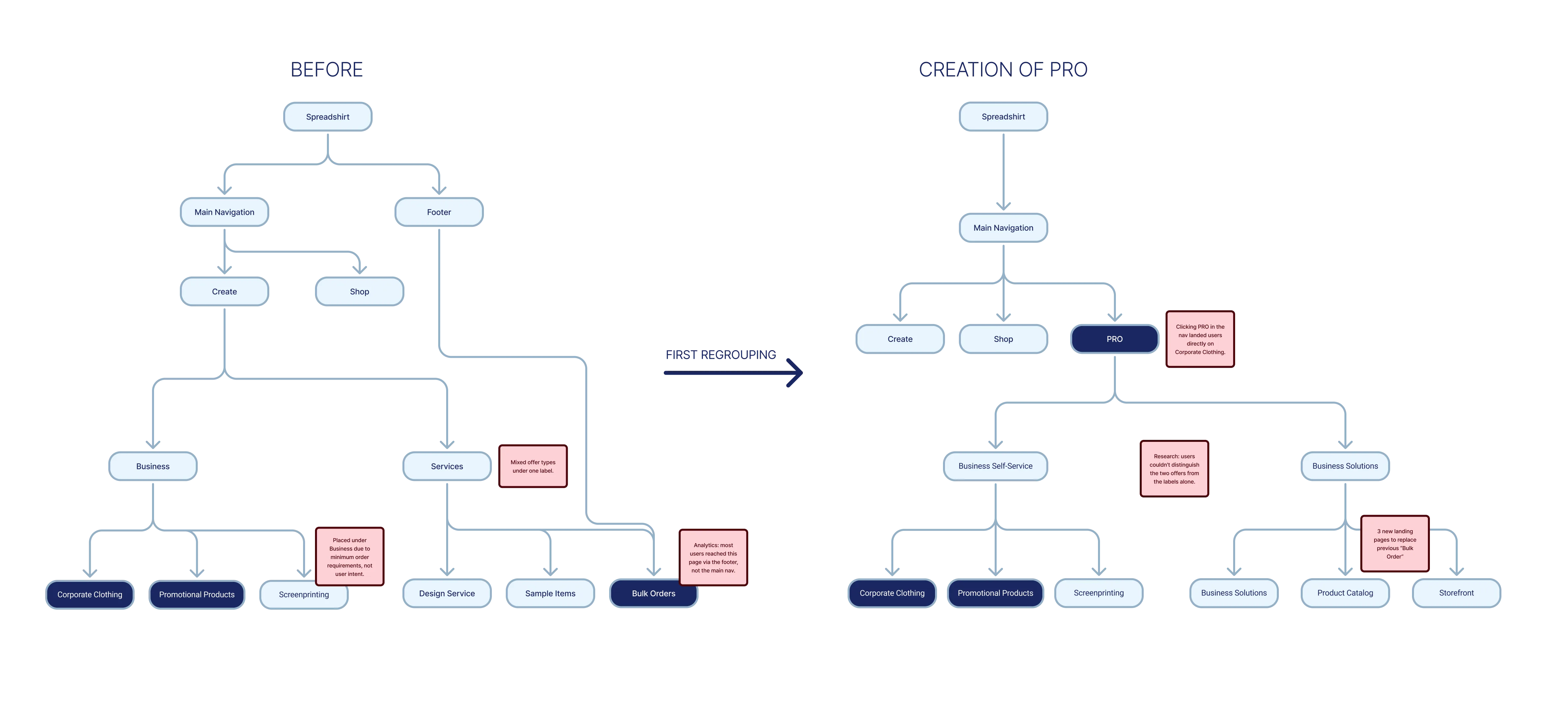
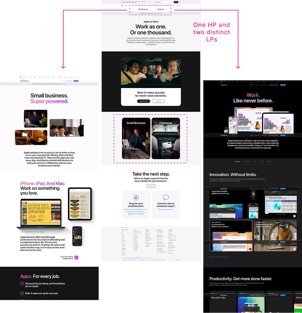
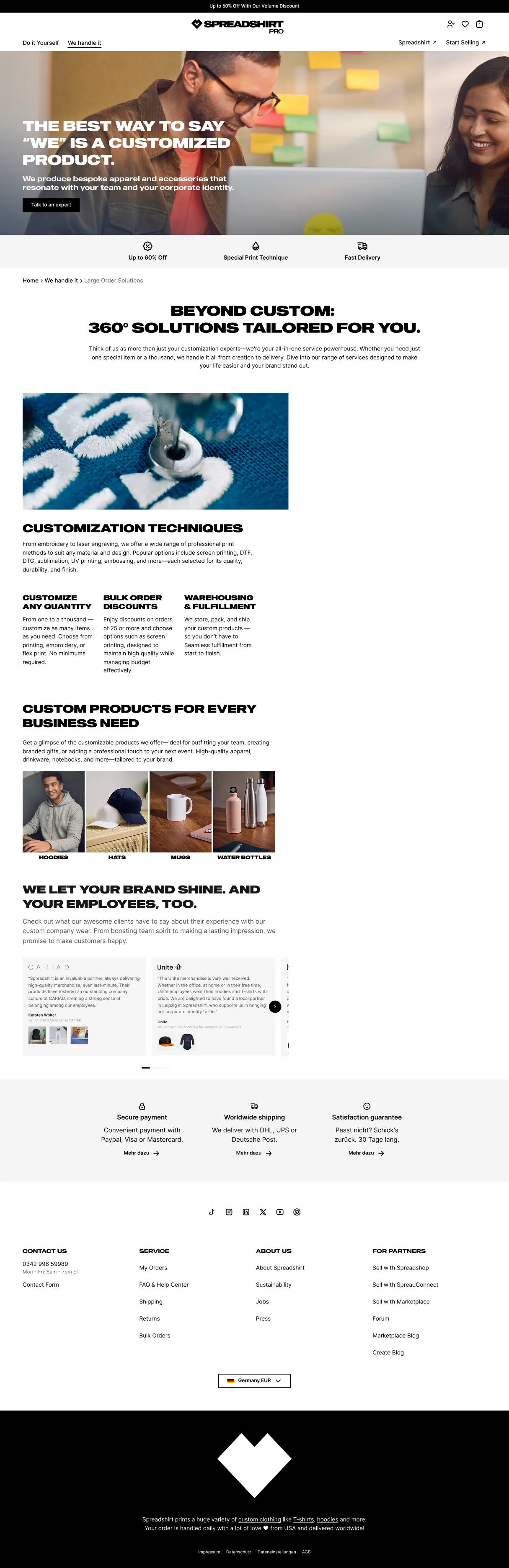
Spreadshirt Pro was born from a structural problem. The platform had two distinct B2B offers: one letting businesses order custom products independently, the other connecting them with an expert who handles everything. Different audiences, different revenue streams, different journeys. But for a long time, they lived in separate corners of the site with no shared identity and very low visibility.
When the decision was made to bring them together under a single section, the grouping existed. The clarity didn't.
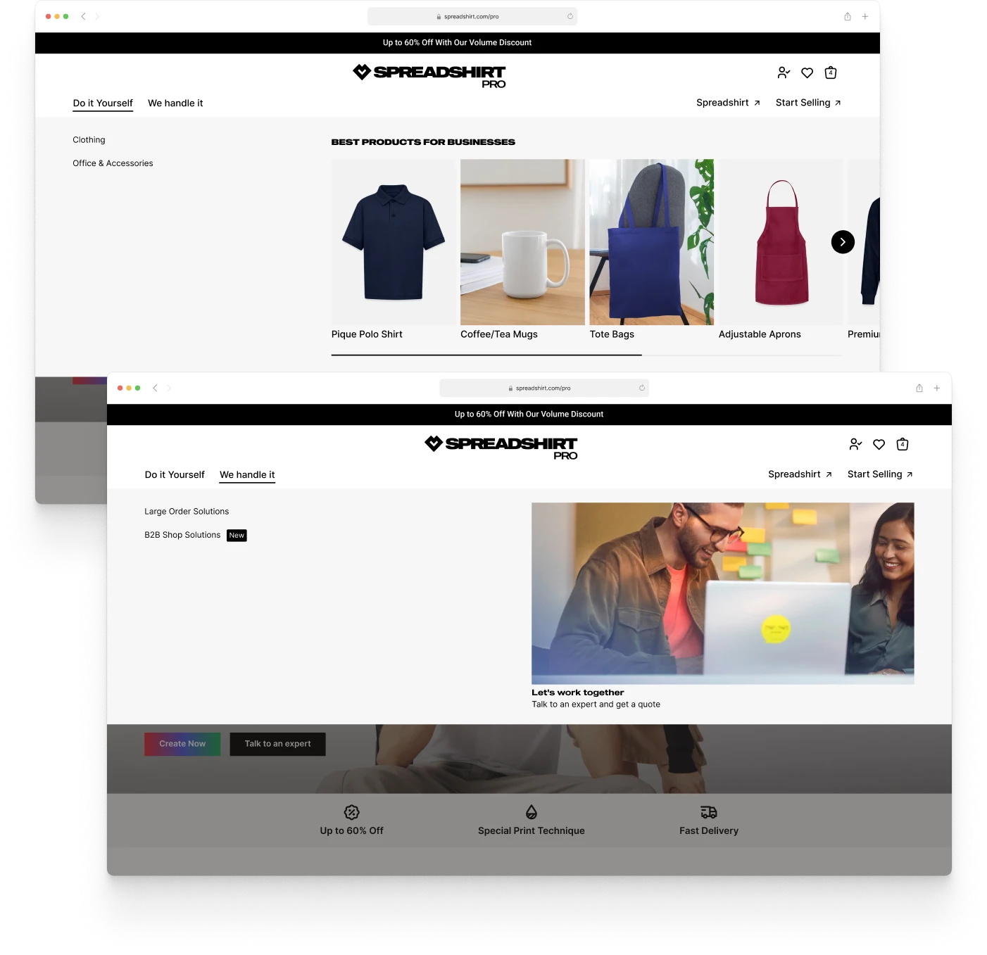
Spreadshirt Pro started as a grouping decision. Two corporate landing pages previously inside the "Create" navigation, and a contact form connecting businesses with an expert, were brought together under a single section: "Business Self-Service" and "Business Solution." It was a step forward. But users — especially those looking for expert help — still couldn't tell what each offer actually meant for them.
Information Architecture
Problem to Solve
Both offers became easier to reach.
The problem was understanding what set them apart.
To understand where the experience was breaking down, I drew on behavioral data (heatmaps), internal analytics, SEO performance data, and stakeholder input from the Business Solution team.
The expert-led offer had almost no organic or direct traffic. All visits came through the navigation, making it structurally dependent on users already knowing it existed. For context: the homepage received over 30 times more visits in the same period.
Within the self-service pages, traffic was heavily concentrated on one landing page. The second was barely registering. Neither was converting well relative to visits — the content wasn't doing enough to turn intent into action.
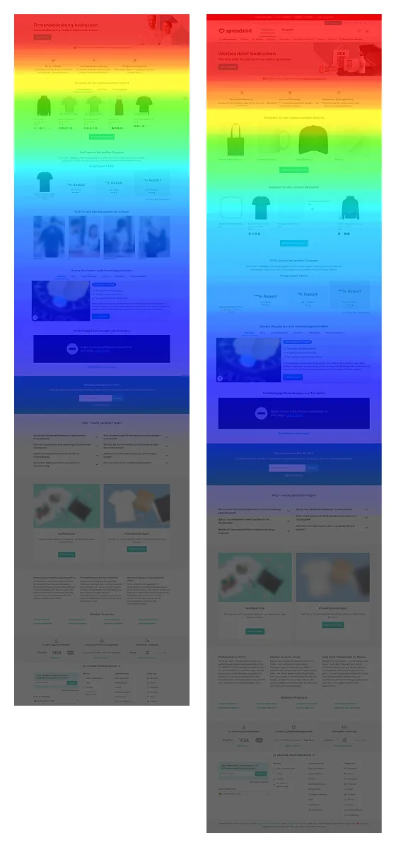
Heatmaps on both self-service landing pages showed the same pattern: strong engagement on the hero and first product tiles, near-zero below. Users weren't scrolling — the pages weren't giving them a reason to.
Stakeholder feedback from the Business Solution team confirmed what the data suggested: existing clients were struggling to find the page. "Business Self-Service" and "Business Solution" described internal product categories, not user situations. For someone who just wanted expert help, neither name pointed clearly to them.
Competitors Analysis
Key Insight
The self-service offer had visibility but wasn't converting. The expert-led offer had almost none. The causes were different, but the result was the same: users weren't finding what they needed.
On desktop, when landing on PRO, both user types hit the corporate clothing page first. For the self-service buyer, that was sometimes fine. For the expert-led client, there was no obvious recovery path. The nav didn't surface an expert route, and the contact form was low on pages. Conversations with the Business Solution team confirmed it: existing clients weren't understanding what the offer was or how to reach someone.
| Path / Phase | 01Arrive | 02Orient | 03Navigate | 04Engage | 05Decide |
|---|---|---|---|---|---|
| Both Users Shared path: before the paths diverge | Clicks PRO in main nav. Lands directly on Corporate Clothing: a product page for customizing clothing via a design tool. 😕 No orientation | Sees clothing products and a designer tool. No context about what Pro offers. The page assumes the user already knows what they want. 😕 No disambiguation | |||
| Self-Service Buyer A team lead who needs branded merch for an event. Needs Browse Personalize Self-checkout | If looking for clothing: finds the right products, uses the design tool, and moves toward purchase. 😊 Right place | If looking for other merch: goes back to nav. Extra step required. The default landing created a false impression of what the offer covers. 😐 Extra step | Lands on the relevant product page. Drop-off below the fold: the content isn't giving users a reason to scroll. 😕 Below-fold drop-off | Converts or continues browsing. Low conversion relative to traffic. Nothing failed outright; nothing quite worked either. 😐 Low conversion | |
| Expert-Led Client A marketing manager commissioning a large branded order. Needs Expert guidance Human contact No DIY | Sees an assortment of clothing to customize independently. Wrong offer entirely, has to go back to nav. 😕 Wrong context | Scans nav: Business Solution / Product Catalog / Storefront. No "contact an expert." Unclear which option is meant for them. 😟 No expert route | Lands on Business Solution. Long page, offer unclear above the fold. Contact form exists but is at the very bottom. Most users drop off before reaching it. 😩 Form buried | Cannot confirm what the offer involves or how to get started. Likely drops off. 😩 Likely drop-off | |
| Emotional Arc — Self-Service Buyer — Expert-Led Client | ▲ More confident Neutral ▼ Less confident | ||||
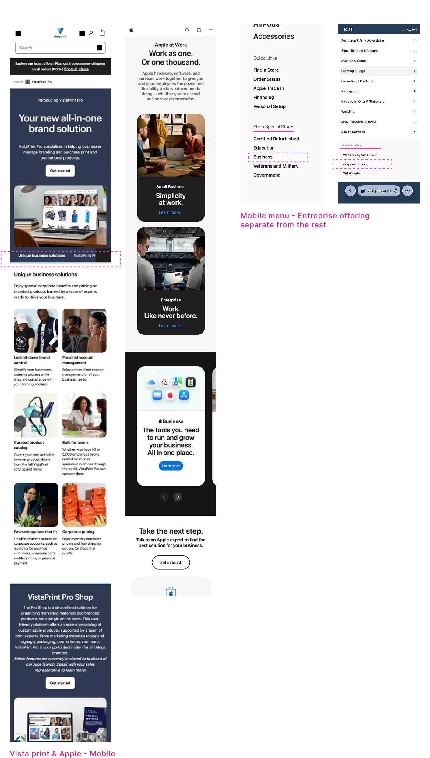
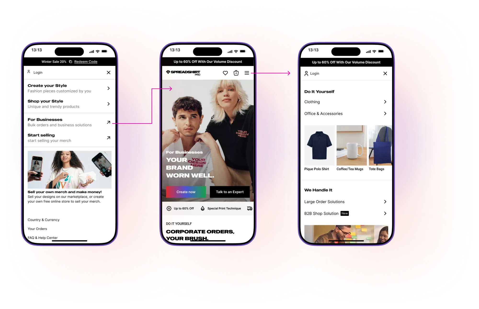
Note: on mobile, the nav menu required users to select an offer directly. Research interviews indicated most users exploring business offers were on desktop.
The single PRO link dropped everyone onto a corporate-clothing product page: no context, no choice. The solution was a dedicated Pro hub, separate from the Spreadshirt store, with both offers visible on arrival. The idea was simple: show users the two paths up front and let them self-select.
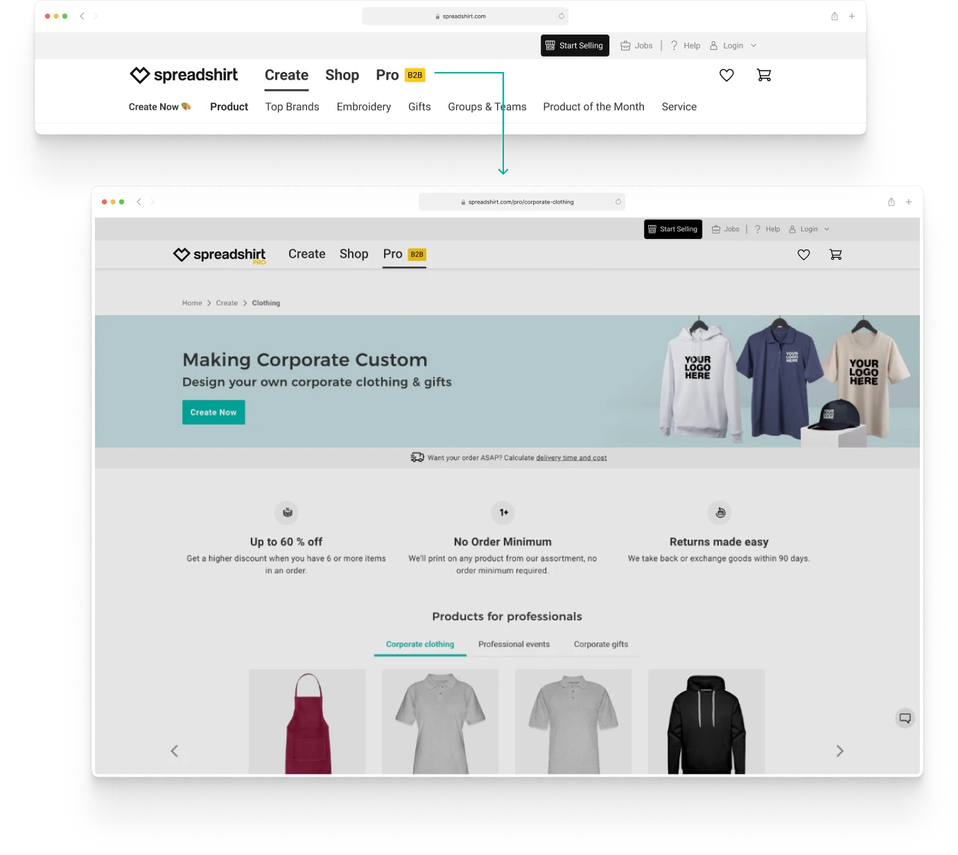
A product page poses as a section. No sign of what Pro is or who it's for.
Business gets its own hub, separate from the Spreadshirt store for individual buyers.
Two buttons above the fold. Users know which path is theirs before scrolling.
Each offer described by what the user gets, not by an internal product category.
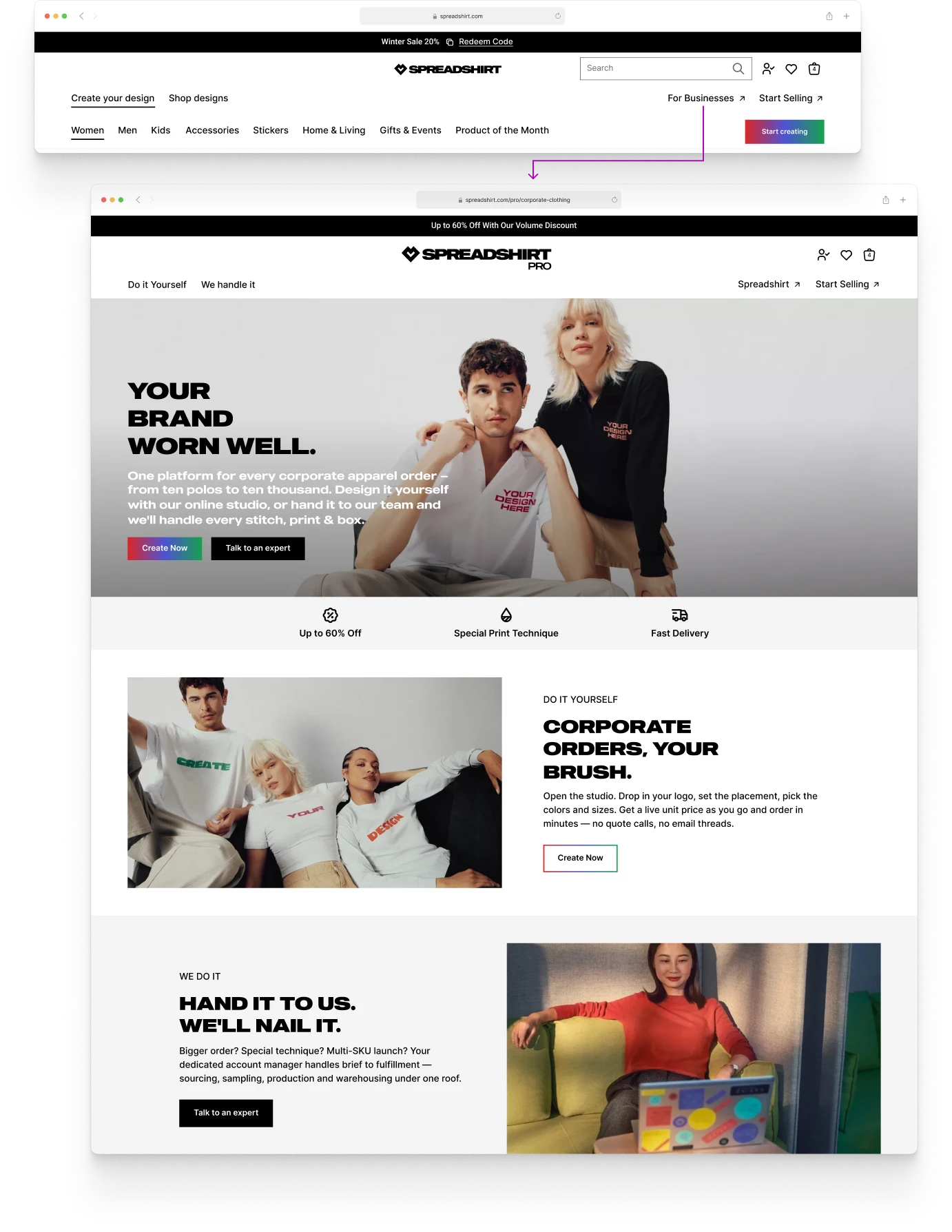
"Business Self-Service" and "Business Solutions" described internal categories, not user situations. Under Business Solutions, three landing pages made the path to expert guidance harder to find. I proposed restructuring the navigation around the decision users were actually making and adding an explicit entry point to reach an expert.
Labels reflect how the business categorised offers, not what users were trying to do.
Users can identify their path from the nav alone, without landing on a page first.
A direct route to expert contact: visible in the nav for the first time.
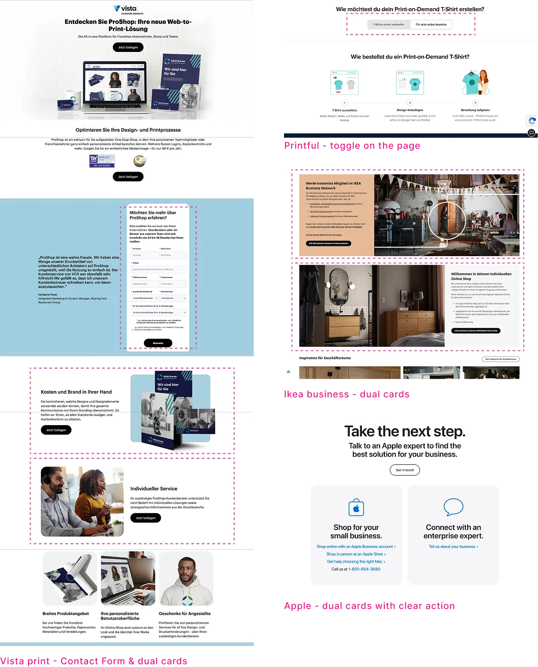
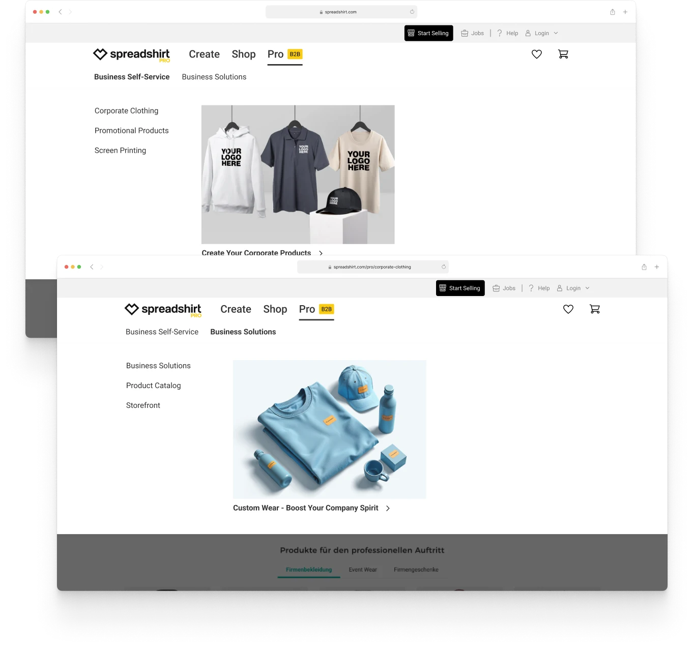
On the Business Solution page the value proposition led with trust and recognition content, but the form to initiate first contact sat at the very bottom. Most users dropped before reaching it. I led with the offer summary above the fold and pinned the enquiry form so it stays in view as the page scrolls.
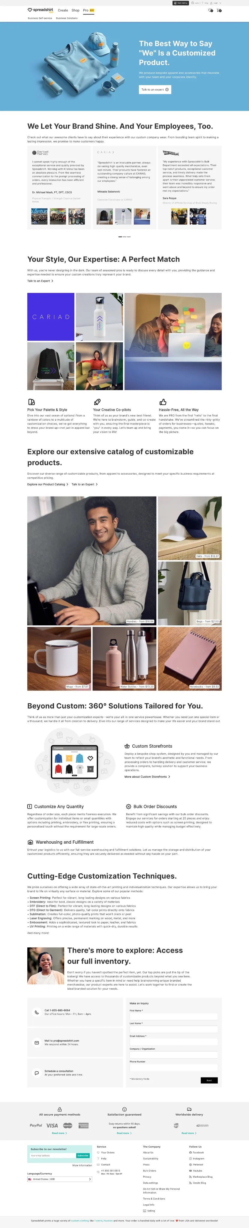
The contact form sits at the very bottom, well past the drop-off point.
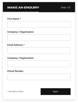
Scroll the page and the enquiry form stays in view the whole way down.
The D2C product was the bigger revenue driver, and that is where the focus went. That is the same period covered in the Homepage and PDP case studies. What shipped was partial. The navigation entry point stayed, and hovering over Pro now reveals a dropdown with “Custom Workwear” and “Personal Service” directly, with no common landing page in between. Users are still asked to choose between two offers before they have been given any context to tell them apart. My sense, thinking back to the original problem, is that what shipped does not fully address it.
What stayed with me most from this project is how different it felt from the rest of my work at Spreadshirt. The audience was not the same as D2C: businesses with specific operational needs, not individual buyers. That shift in context made the problem genuinely interesting to work through. I also spent a lot of time in meetings with two directors and a product owner, going back and forth on offer structure, naming, navigation logic. That kind of cross-functional work takes time, and I came away having learned a lot. After months of rebranding work, it felt like a real change of pace.
More of the Spreadshirt work — from product pages to the enterprise B2B platform.
SPREADSHIRT
This redesign ultimately boosted conversion rates by 10% and provided 5+ flexible modules for the marketing team.
SPREADSHIRT
A two-phase redesign of Spreadshirt's product detail pages — fixing information hierarchy, restructuring the buy section, and surfacing trust signals to turn more visits into purchases.
If you're hiring for a product designer, I'd love to talk. Here's how to reach me.
I usually reply within a day.