SPREADSHIRT
Revamp Spreadshirt Homepage
This redesign ultimately boosted conversion rates by 10% and provided 5+ flexible modules for the marketing team.
Spreadshirt · Case Study
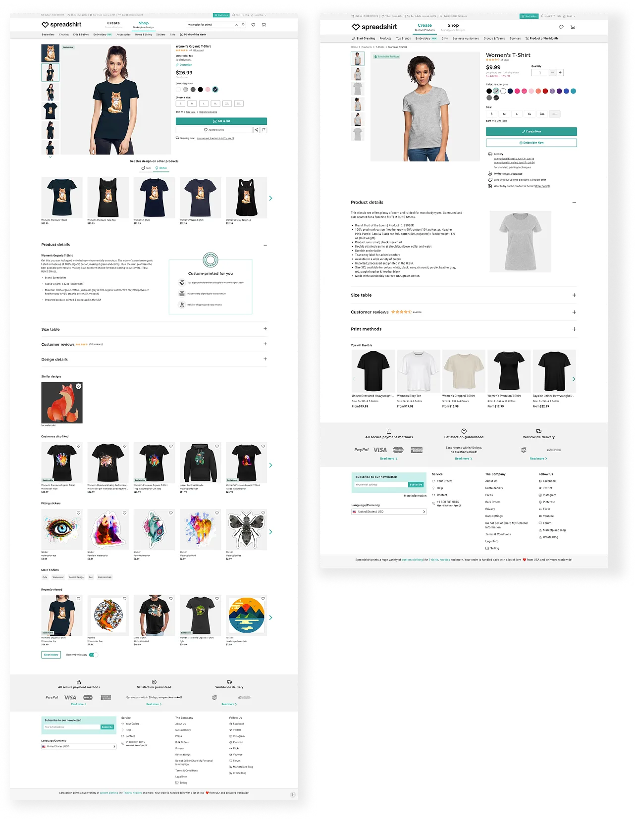
Spreadshirt serves two distinct audiences: shoppers browsing existing designs, and users who want to create their own. Each had their own product detail page — the MP PDP for marketplace purchases, and the ADP for the create-your-own flow. The MP PDP was underperforming, and for reasons that ran deeper than aesthetics.
What started as a targeted SEO and UX audit in late 2023 grew into a full redesign as part of the broader rebrand. I led Phase 1 as sole designer, then co-led Phase 2 with one other designer, driving consistency across both pages.
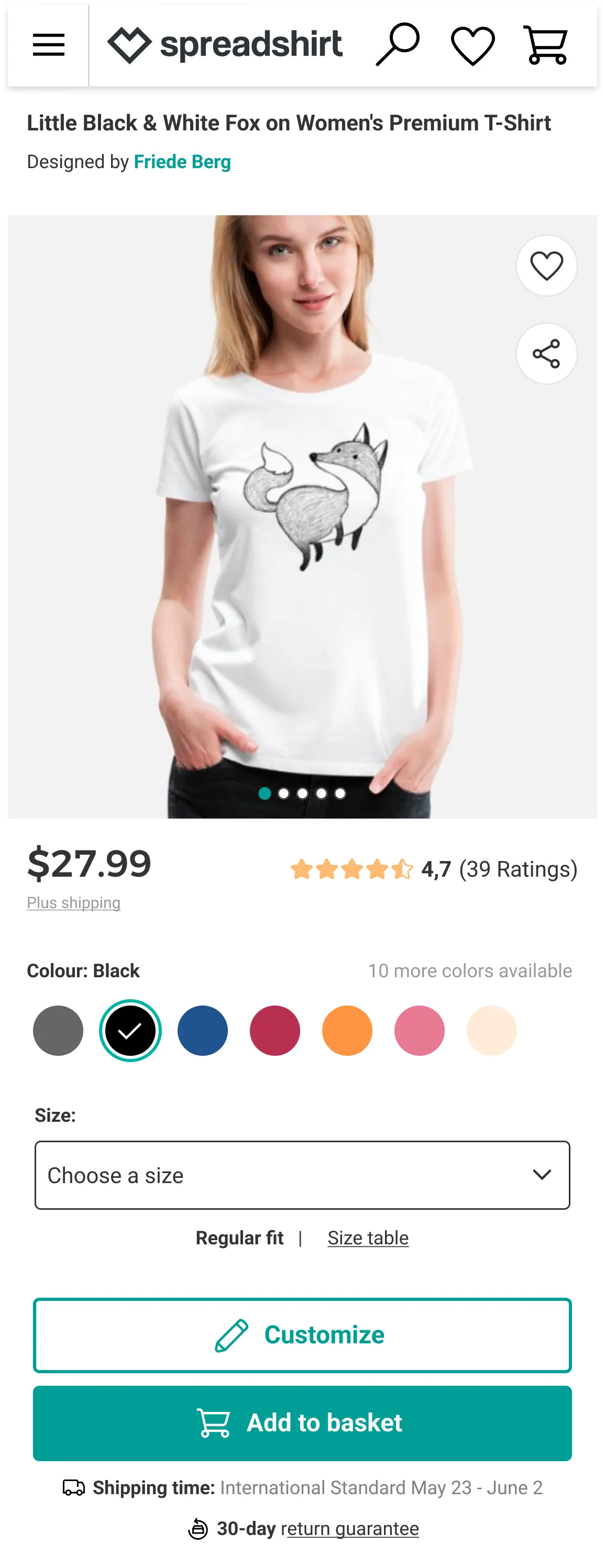
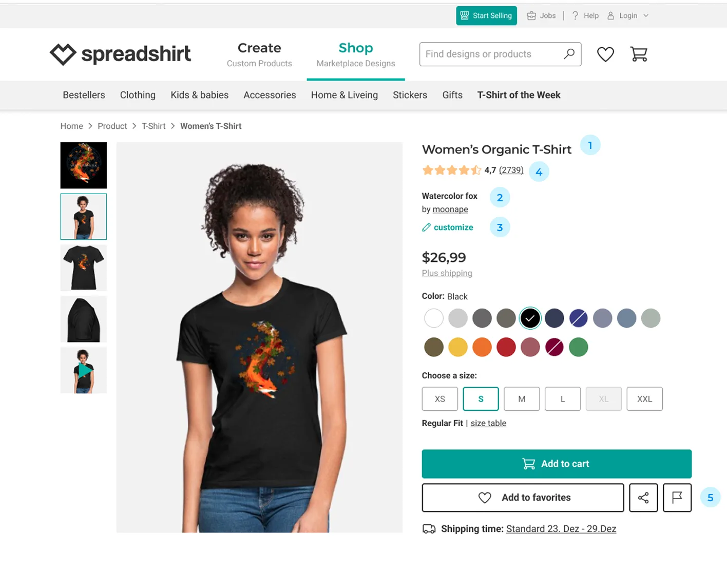
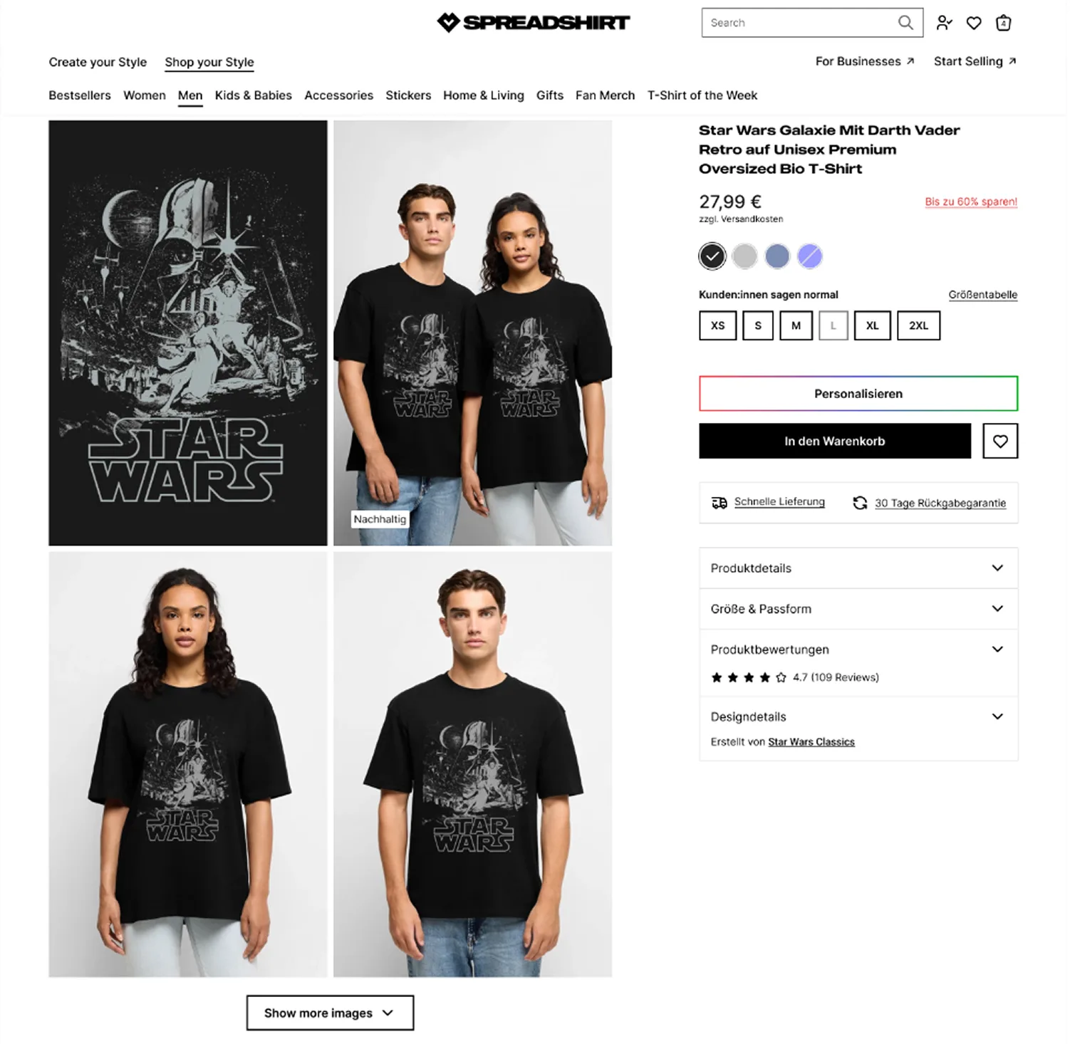
The MP PDP was the primary entry point for marketplace shoppers — and for many, it was their first impression of Spreadshirt. But the page wasn't set up to capitalise on that. Outdated layout, weak hierarchy, and the wrong search terms meant a page that neither ranked well nor converted.
Problem to Solve
Most shoppers landed on the Marketplace PDP straight from search.
Too few of them bought anything.
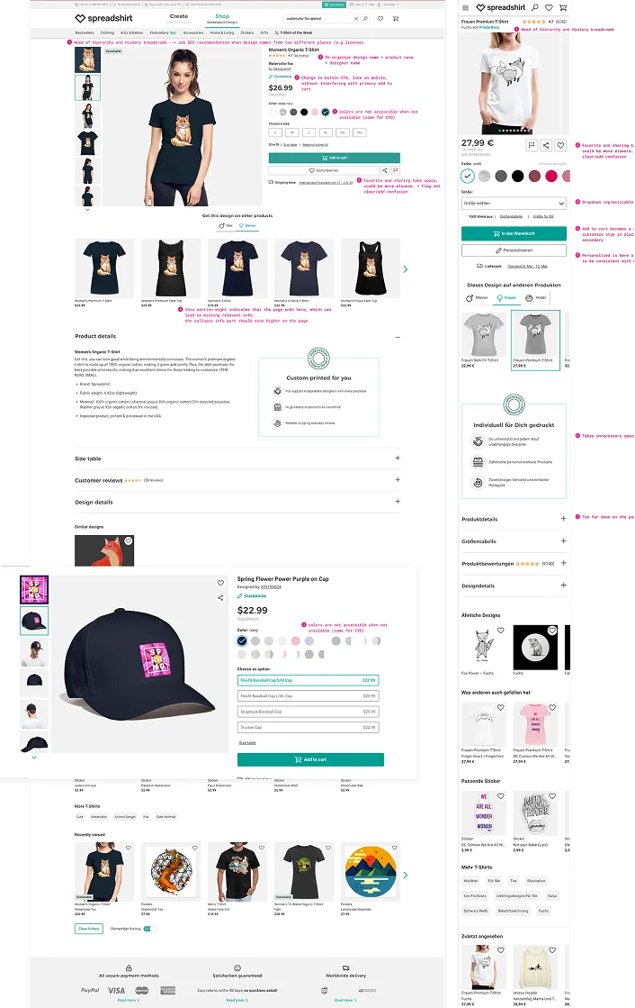
To inform the redesign, I drew on behavioural data, click analytics, a structured UX audit using Baymard Institute benchmarks, and competitive analysis across both print-on-demand platforms and larger fashion brands. Together these revealed a page that was creating friction at every step and falling behind the e-commerce standard.
Most Marketplace PDP traffic arrived directly from organic search, bypassing the homepage entirely. But page titles led with product type rather than design name — putting Spreadshirt in direct competition with every major apparel retailer. The opportunity was in design-specific searches, where intent was stronger.
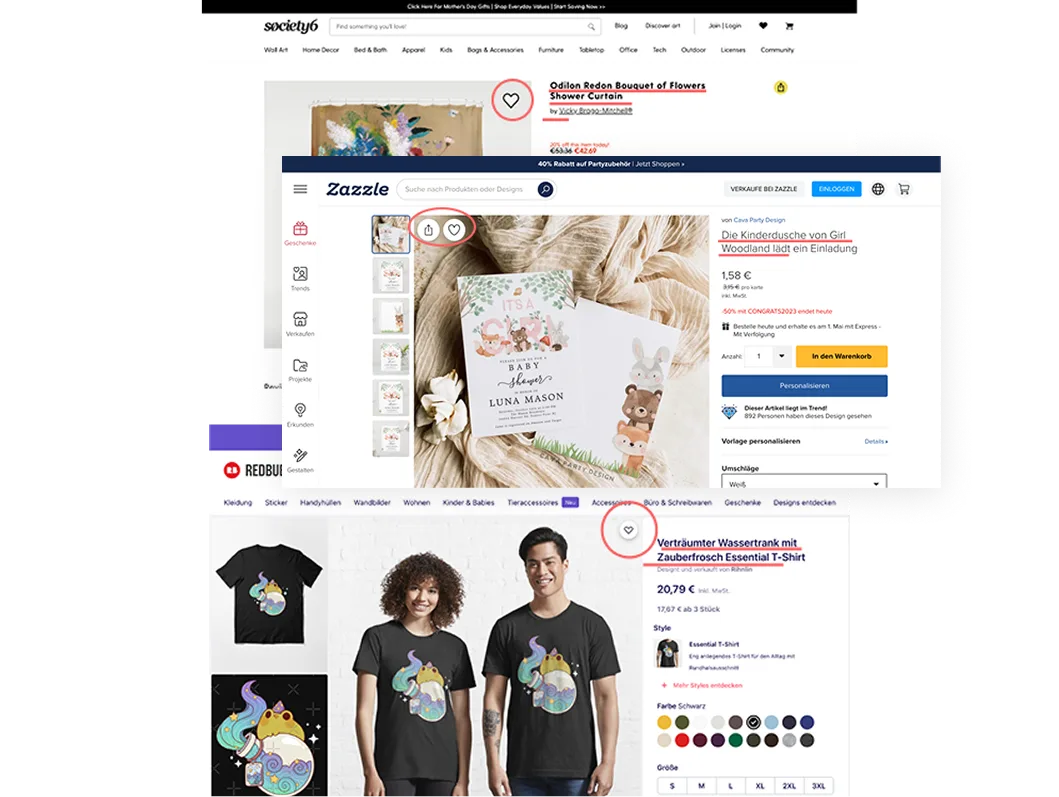
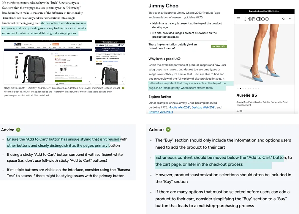
The UX audit flagged the buy section as the weakest area against Baymard benchmarks. Analytics showed social sharing was almost entirely ignored, and add-to-favourite was styled as a full CTA, taking up space and breaking from standard e-commerce patterns.
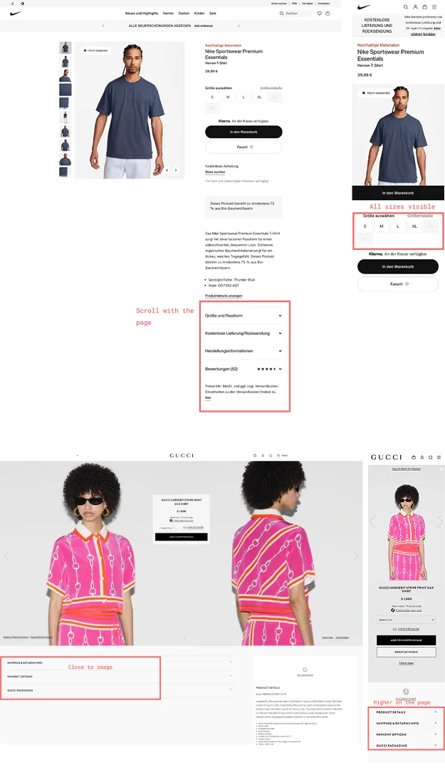
Across both print-on-demand platforms and larger fashion brands, the pattern was consistent: tighter visual hierarchy, trust signals and reviews close to the CTA, and interaction patterns that felt current. The gap between Spreadshirt's PDP and the broader e-commerce standard was visible.
Breadcrumb navigation was a clear gap, but proved hard to implement: most traffic lands from Google, and products belong to multiple categories, making a consistent breadcrumb logic difficult to define. It remains unresolved.
Audit & Competitive Analysis
Key Insight
Users arrived ready to buy. The page wasn't ready for them.
Phase 1
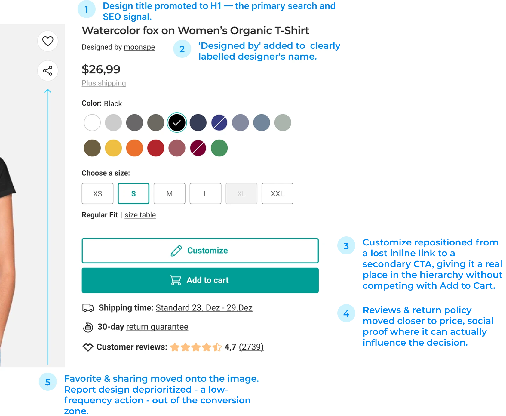
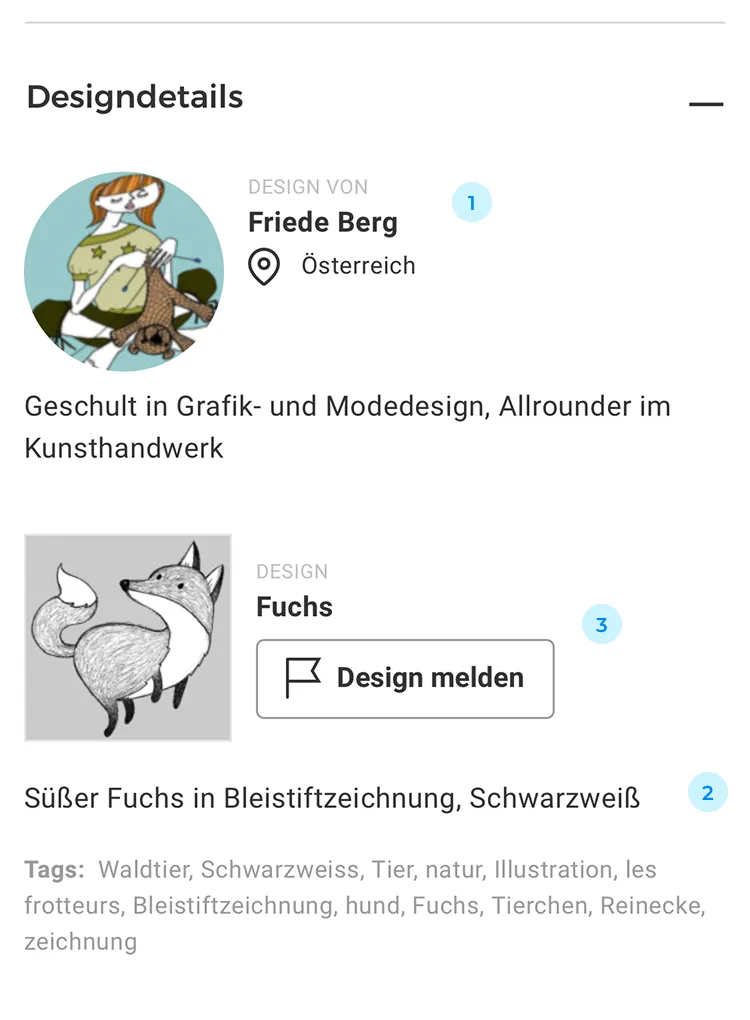
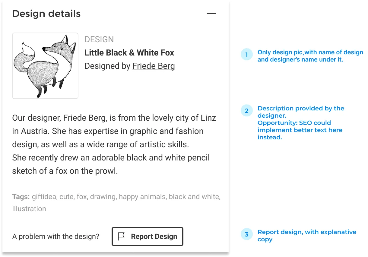
The buy section had most of what it needed but little of it was in the right place. The title didn't lead with the design. The customize link was easy to miss. Reviews were isolated from the trust signals that reinforce them. The restructure brought them together.

 Before After
 Phase 1
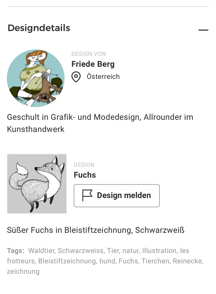
To better represent designers and their work, the section was also restructured. It now offers a clear access to their showroom and a better understanding of the report option.
 Before
 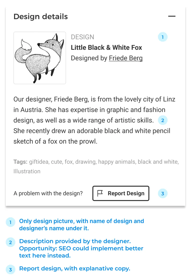 After
After Phase 2
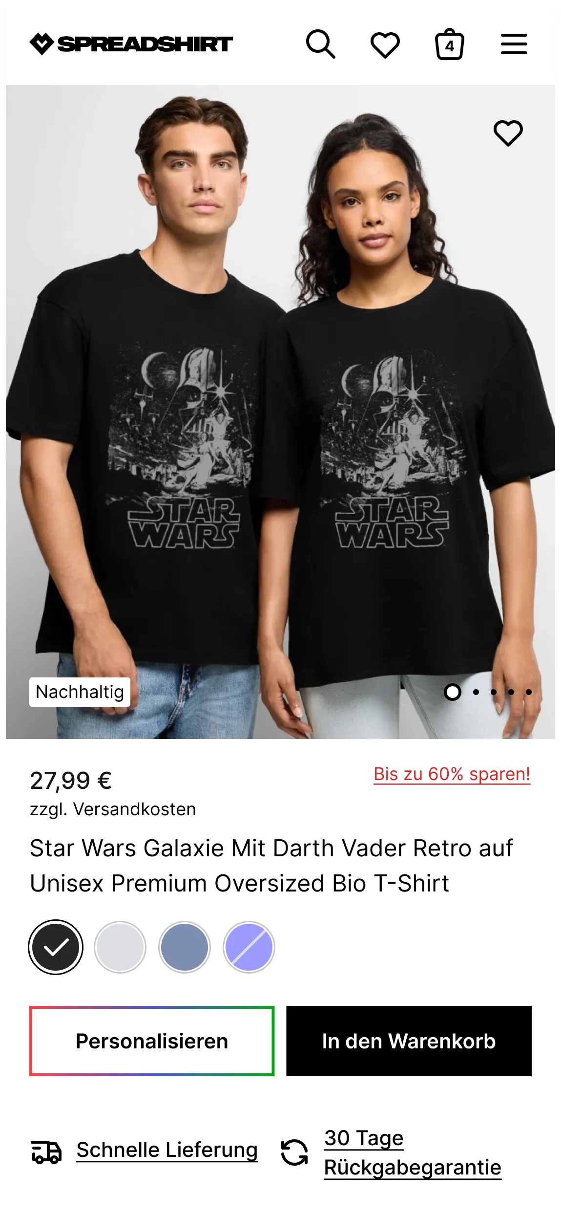
Phase 2 brought the rebrand. The old page had aged visibly and it no longer reflected where the brand wanted to go or who it wanted to reach. With the new brand direction set at company level, my co-lead and I made every design decision from there: how the page looked, how components were built, how the system held together across both the MP PDP and the ADP. Phase 1's structural logic carried forward; this phase was about making it modern, consistent, and built for a younger audience.
On mobile, every pixel of the first viewport counts. The layout was tightened so users land with a clear choice in front of them: buy or personalize — without having to scroll to find it.
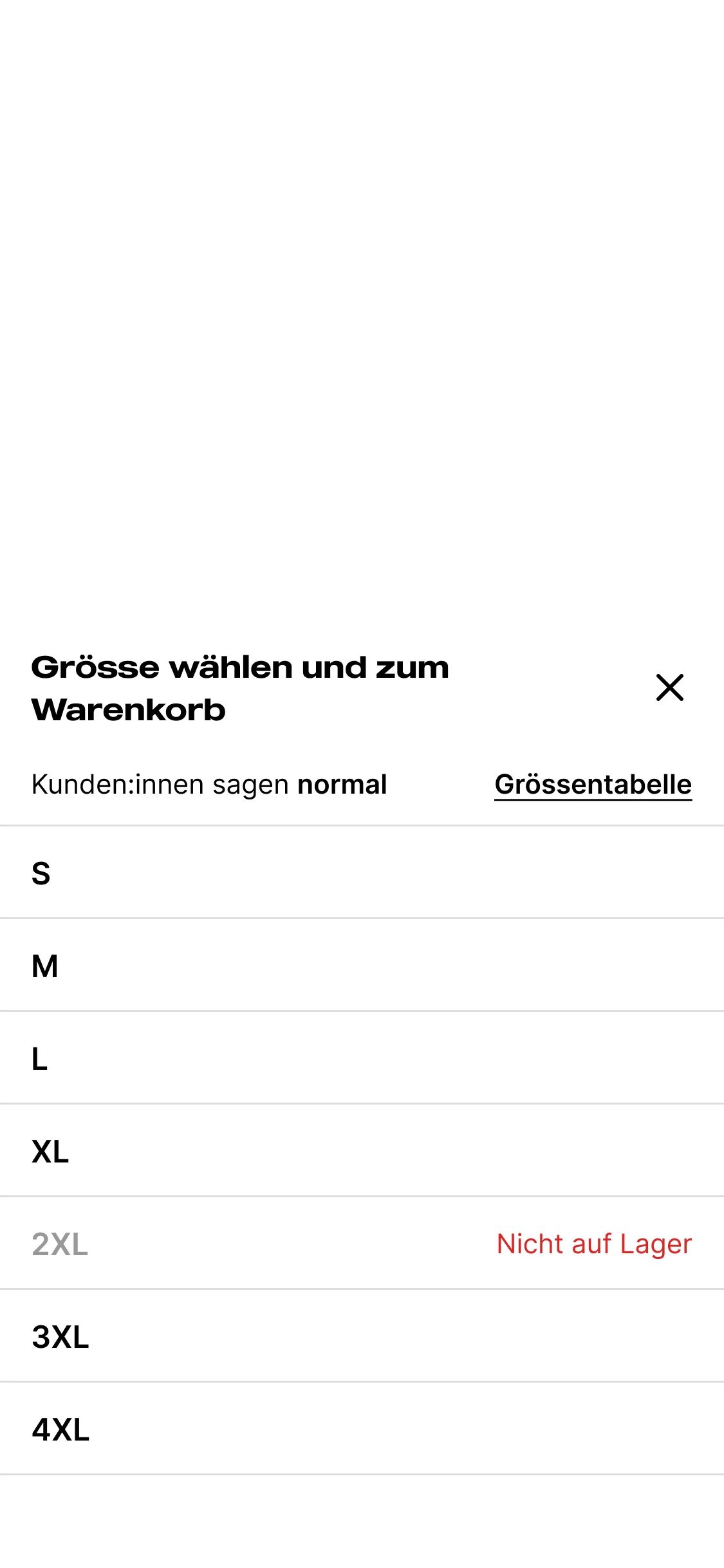
On mobile, a dropdown was used to pick sizes: awkward once options exceeded five, and taking up space whether the user was ready to choose or not. Phase 2 replaced it with an overlay triggered by Add to Cart, surfacing the choice at the right moment without cluttering the viewport.

Phase 1
Phase 2
Phase 1
Phase 2
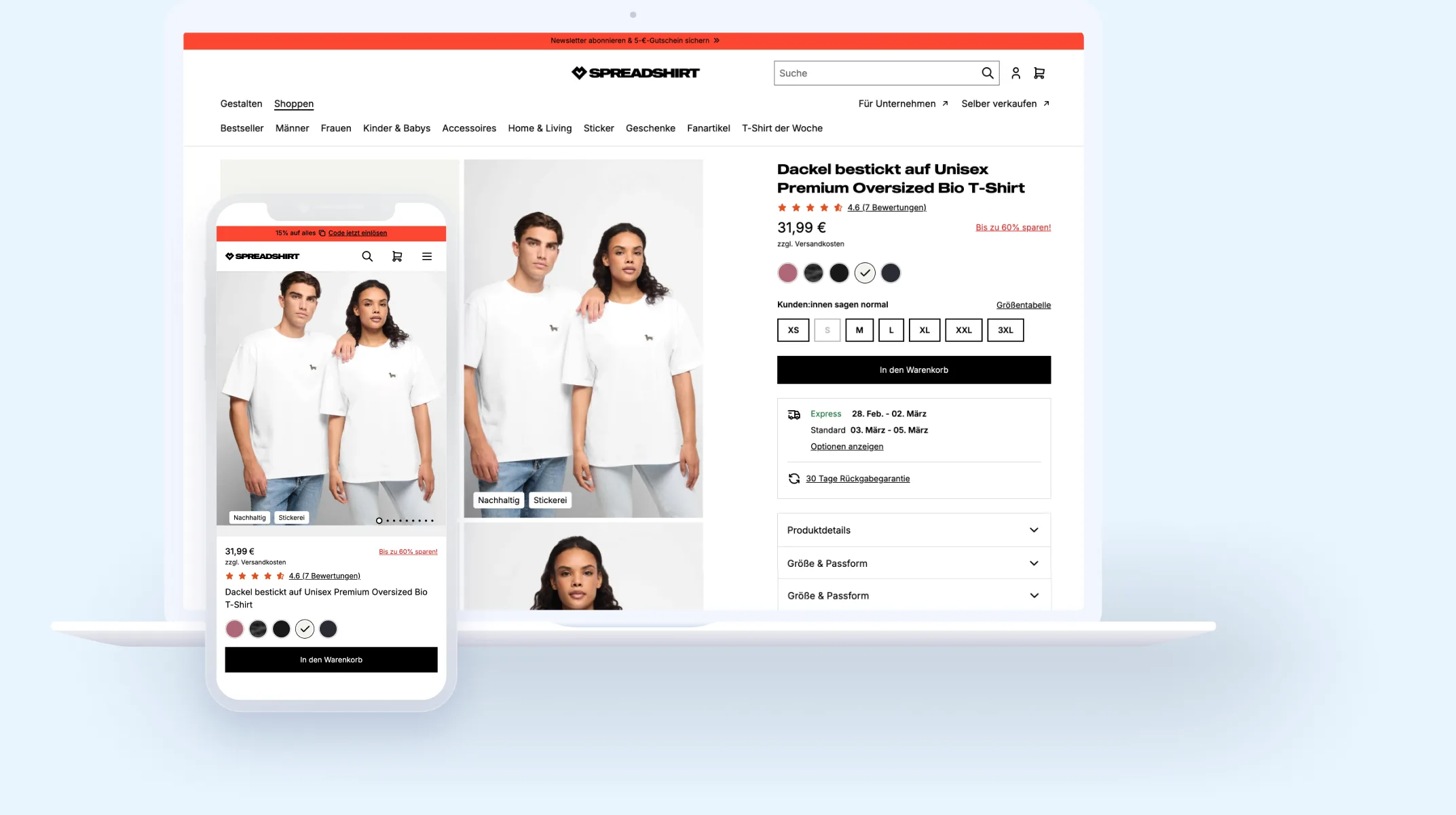
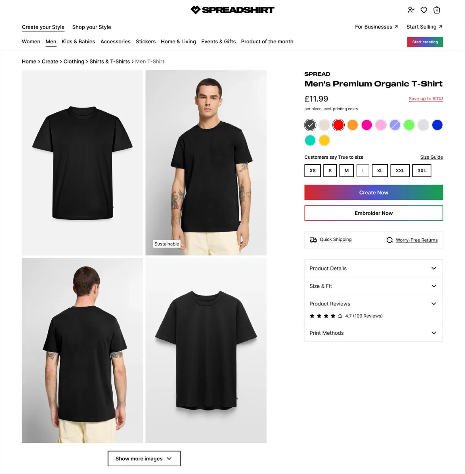
The carousel hid most images behind a click. Switching to a four-image grid makes the product visible from the start — different angles, different contexts, no interaction required.
On both desktop and mobile, product details, sizing, and reviews were previously tucked below a cross-sell slider — easy to miss and easy to skip. Moving them into a structured accordion directly below the buy section made the page feel complete, not truncated.
The ADP — for blank products to be personalized — was redesigned to mirror the MP PDP structure while keeping its own identity. The gradient CTA is new to the rebrand: a visual signal for creativity that runs across both pages, fully expressed here where personalization is the primary action.
The redesign was tested as an A/B across EU markets from October 2025, starting with Austria, Netherlands, Belgium, and Poland. Germany — the largest EU market — ran multiple test phases. The 70/30 split in November significantly outperformed the old journey, and results were strong enough for the business to make the call: ship it.
Results were consistent enough across markets to move from testing to full rollout. By March 2026, the new PDP was live across all EU domains.
Phase 1 started as a targeted fix — the SEO problem was the brief, and the scope was deliberately narrow. But working through it gave me a detailed picture of everything else that needed attention. When the rebrand arrived, I already knew where the frictions were.
Phase 2 was a different kind of challenge. Two designers tasked with redesigning every page of the website as part of a full company rebrand. At times, other designers joined, but I was the only one who stayed consistently across the entire project. The A/B test was the right call, but with so many changes shipping at once, the data tells you whether something moved — not what caused it or what to fix next. More targeted testing, earlier in the process, would have given us sharper answers.
Two things remain unresolved for this page type. Breadcrumb navigation on the MP PDP was deprioritized: a logic problem more than a technical one, with no clean answer for users arriving directly from google search. And on the MP PDP, users can save a design product to their favorites, but not a blank product on the ADP, where the favorites system is tied to designs rather than products. From the outside, there's no reason that distinction should be visible. I'd expect most users to read it as a bug. Both are worth addressing — they just didn't make the cut this time.
More of the Spreadshirt work — from product pages to the enterprise B2B platform.
SPREADSHIRT
This redesign ultimately boosted conversion rates by 10% and provided 5+ flexible modules for the marketing team.
SPREADSHIRT
Redesigning Spreadshirt's B2B experience to help enterprise clients manage bulk orders, customisation, and account workflows — making a complex platform feel simple.
If you're hiring for a product designer, I'd love to talk. Here's how to reach me.
I usually reply within a day.